The main subject in this particular image is the old fashioned telephone box.
I took this picture because I liked the strong textures on the telephone box and the building behind it.
This image focuses the attention on the main subject by isolating the one colour (in this case red) from the rest of the image. Also the relatively shallow depth of field makes the background blurry and separates the foreground from the background.
This image has very prominent lines. The vertical window frames of the phone box are almost parallel to the vertical lines of the lamp post. The textures of the foreground are strong and detailed whereas the background textures are visible but are slightly blurred out.
This photo could be greatly improved if I hadn't had cut off the side of the phone box. As you can see the right hand side of the phone box is extending out of the frame.
My peers find that the fact the image contains a quite vintage subject makes the image more appealing, they also said that because of how old it looks, the phone box seems to be 'decaying slowly over time'. Others say that the left hand side of the image is very plain which removes some of the interest of the image.
Compared to a professional image, it seems that I have a lot of work to do. This image contains aspects of a landscape image by having the mountains in the background. The phone box has more texture than my own image, and by standing further away form the subject, isolates the image more after it has been through processing. The image is similar to mine because of the phone box as the subject and the one, strong red colour is used to isolate the image.
The main subject of this image is the King Charles Spaniel.
I took this picture when I received my newest lens (50mm ƒ/1.8) and I was really just taking pictures every few seconds. When sat next to the dog I noticed that she had been staring at me for quite some time (probably because I had food in my hand). I took advantage of how long she had been staring at me and decided to take the picture.
The image focuses it's attention on the main subject by using the lenses wide aperture (ƒ/1.8). This creates a very shallow depth of field, the left eye of the dog is strongly in focus whereas anything behind the eye is blurred out of focus.
The elements of design that make this image work are the strong textures of the dog's coat. Also the spiral lines that go around the dog's eye are very sharp.
This shot could have been improved by framing it better. At the bottom of the frame the dog's ear has been cut off slightly. I would have re-framed the image so all parts of the dog's head is included in the frame.
 My peers feel that the image was very effective and appealing. Although they did pick up on the point that the lower ear was cut off when framed.
Compared to a professional image I noticed that it has been well framed compared to my own. I feel my image is just as good as this one though, my image was focusing on a head shot close up which allowed the detail of the dogs fur to me more noticeable and sharp.
The main subject of this image is the two fuchsias in the center of the frame.
The main subject of this image is the King Charles Spaniel.
I took this picture when I received my newest lens (50mm ƒ/1.8) and I was really just taking pictures every few seconds. When sat next to the dog I noticed that she had been staring at me for quite some time (probably because I had food in my hand). I took advantage of how long she had been staring at me and decided to take the picture.
The image focuses it's attention on the main subject by using the lenses wide aperture (ƒ/1.8). This creates a very shallow depth of field, the left eye of the dog is strongly in focus whereas anything behind the eye is blurred out of focus.
The elements of design that make this image work are the strong textures of the dog's coat. Also the spiral lines that go around the dog's eye are very sharp.
This shot could have been improved by framing it better. At the bottom of the frame the dog's ear has been cut off slightly. I would have re-framed the image so all parts of the dog's head is included in the frame.
 My peers feel that the image was very effective and appealing. Although they did pick up on the point that the lower ear was cut off when framed.
Compared to a professional image I noticed that it has been well framed compared to my own. I feel my image is just as good as this one though, my image was focusing on a head shot close up which allowed the detail of the dogs fur to me more noticeable and sharp.
The main subject of this image is the two fuchsias in the center of the frame.
When wandering around with my camera (and my 55-250mm ƒ/4-5.6) I was taking pictures of just about anything. I wanted a close up of these flowers but I had no idea that the background would blur out as much as it did.
Because the lens was at its longest (250mm ƒ/5.6) it made the background seem close to the foreground, hence making it blurry. This shallow depth of field allowed the foreground to stand out from the background a lot greater.
The elements that make this image so effective is the bright colours of the fuchsias contrasting the dull greens of the background.
This image has actually been edited a fair amount. The bottom bulb of the right fuchsia was actually cut off when the image was taken and I didn't realise until I returned home. I copied the bulb that was in the image and pasted it of top of the other. After scaling and erasing some of the background (with a very soft brush) the image looked a lot nicer. Also the pettle from another flower in the bottom left does distract the user somewhat. I need to spend more time on my framing of curtain images to improve their standard.
 Again with this image my peers questioned the framing of the photograph. Aside from that they believed it was a bright, colourful photograph, and the contrasting colours added to its appeal.
Compared to a professional image I feel that my image is slightly more appealing; the colours are nicer and the level of contrast (between light and dark colours) isn't as intense.
The subject of the following image is, quite obviously, the boat.
I took this picture when on holiday in Scotland. When waking along the beach, due to the wind, there was sand flying everywhere. This i thought would make the background of an image softer and beautifully out of focus (as well as damage my lens!). When I saw this boat, idly positioned, in the middle of the beach. The background of the rocks by the sea was successfully blurred out by the sand, as planned, and it made the image more soft and appealing.
To focus the attention of the subject i added a vignette (soft black boarder) this made the boat, being in the center, stand out more. Also by pumping up the black and white contrast of the image also allowed for the subject to be more noticeable.
The elements that make this image work are the vertical lines of the mast and the horizontal lines mechanism housing the vessel. Also the strong contrast and minimal saturation, in this case, make the image more effective. As you can see in my before an after post (http://rhysthomasmedia.blogspot.co.uk/2013/04/images-that-i-have-maniulated.html) the unedited version wasn't nearly as appealing as the edited version.
To make this image more effective, i would like to have a more dramatic skyline but not too dramatic that it distracts the user from the main subject.
Compared to a professional image, my image isn't so great. This image [left] has a very dramatic skyline and the background is slightly clearer. Also there is a strong contrast, similar to mine but this image has a slightly more detailed flooring underneath the boat. My image has sand and sea weed, while the professional image has pebbles and rocks which are really detailed and sharp. The texture of these rocks and the dramatic skyline make this image a lot more appealing than my own.
The subject in this image is the dramatic sunset.
I took this image during the bank holiday weekend at the start of May. It was the first time we have seen sun this year, and as well as the sun, colourful sunlight was also delivered.
To focus the viewers attention on the detail in the clouds, the distractions like the house are silhouetted and contrast with the brightness behind the clouds.
The elements that make this image work include: The strong textures in the clouds and the bright colours in the sky contrasting that of the silhouetted buildings.
To improve this image I would like the line of houses more horizontal, maybe even a main focal point in the center of the image, for example a flock of birds flying over the buildings, also silhouetted like the houses below them.
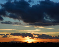 Compared to a professional image, my image seems to be more dramatic and detailed. What makes the professional image effective is that the sun is framed in the image, as well as the clouds. This gives the image a bit more of a subject for the user to focus on.
Because the lens was at its longest (250mm ƒ/5.6) it made the background seem close to the foreground, hence making it blurry. This shallow depth of field allowed the foreground to stand out from the background a lot greater.
The elements that make this image so effective is the bright colours of the fuchsias contrasting the dull greens of the background.
This image has actually been edited a fair amount. The bottom bulb of the right fuchsia was actually cut off when the image was taken and I didn't realise until I returned home. I copied the bulb that was in the image and pasted it of top of the other. After scaling and erasing some of the background (with a very soft brush) the image looked a lot nicer. Also the pettle from another flower in the bottom left does distract the user somewhat. I need to spend more time on my framing of curtain images to improve their standard.
 Again with this image my peers questioned the framing of the photograph. Aside from that they believed it was a bright, colourful photograph, and the contrasting colours added to its appeal.
 Compared to a professional image I feel that my image is slightly more appealing; the colours are nicer and the level of contrast (between light and dark colours) isn't as intense.
The subject of the following image is, quite obviously, the boat.
I took this picture when on holiday in Scotland. When waking along the beach, due to the wind, there was sand flying everywhere. This i thought would make the background of an image softer and beautifully out of focus (as well as damage my lens!). When I saw this boat, idly positioned, in the middle of the beach. The background of the rocks by the sea was successfully blurred out by the sand, as planned, and it made the image more soft and appealing.
To focus the attention of the subject i added a vignette (soft black boarder) this made the boat, being in the center, stand out more. Also by pumping up the black and white contrast of the image also allowed for the subject to be more noticeable.
The elements that make this image work are the vertical lines of the mast and the horizontal lines mechanism housing the vessel. Also the strong contrast and minimal saturation, in this case, make the image more effective. As you can see in my before an after post (http://rhysthomasmedia.blogspot.co.uk/2013/04/images-that-i-have-maniulated.html) the unedited version wasn't nearly as appealing as the edited version.
To make this image more effective, i would like to have a more dramatic skyline but not too dramatic that it distracts the user from the main subject.
Compared to a professional image, my image isn't so great. This image [left] has a very dramatic skyline and the background is slightly clearer. Also there is a strong contrast, similar to mine but this image has a slightly more detailed flooring underneath the boat. My image has sand and sea weed, while the professional image has pebbles and rocks which are really detailed and sharp. The texture of these rocks and the dramatic skyline make this image a lot more appealing than my own.
The subject in this image is the dramatic sunset.
I took this image during the bank holiday weekend at the start of May. It was the first time we have seen sun this year, and as well as the sun, colourful sunlight was also delivered.
To focus the viewers attention on the detail in the clouds, the distractions like the house are silhouetted and contrast with the brightness behind the clouds.
The elements that make this image work include: The strong textures in the clouds and the bright colours in the sky contrasting that of the silhouetted buildings.
To improve this image I would like the line of houses more horizontal, maybe even a main focal point in the center of the image, for example a flock of birds flying over the buildings, also silhouetted like the houses below them.
 Compared to a professional image, my image seems to be more dramatic and detailed. What makes the professional image effective is that the sun is framed in the image, as well as the clouds. This gives the image a bit more of a subject for the user to focus on.


